Cooling Blue: The Color of Calm in a Chaotic World
Let’s be honest, the world feels like it’s running on a perpetual high-speed setting sometimes. Notifications ping, screens glare, to-do lists grow, and the mental static can become overwhelming. In the midst of all this heat—both literal and metaphorical—we instinctively seek relief. We crave a cool drink, a shady spot under a tree, or a deep, calming breath. And more often than not, our eyes, and our souls, are drawn to one thing: the color blue.
But not just any blue. I’m talking about cooling blue. This isn’t a single, specific shade you can find on a paint swatch.
This article is my deep dive into the magic of cooling blue. We’ll explore not just what it is, but why it affects us so deeply. We’ll journey through science, art, design, and even our own backyards to understand how this fundamental color shapes our perception, our emotions, and our physical well-being. I’ll share personal stories, professional opinions, and practical tips on how to invite more of this calming power into your own life. So, find a comfortable spot, maybe take a glance at something blue nearby, and let’s unravel the serene mystery of cooling blue together.
The Science of Serenity: Why Blue Feels “Cool”
Before we get to the aesthetics, we have to start with the biology. Our reaction to blue isn’t just cultural or learned; it’s wired into us. Understanding this helps explain its universal, almost primal, appeal.
The Hardwired Response: Sky, Water, and Survival
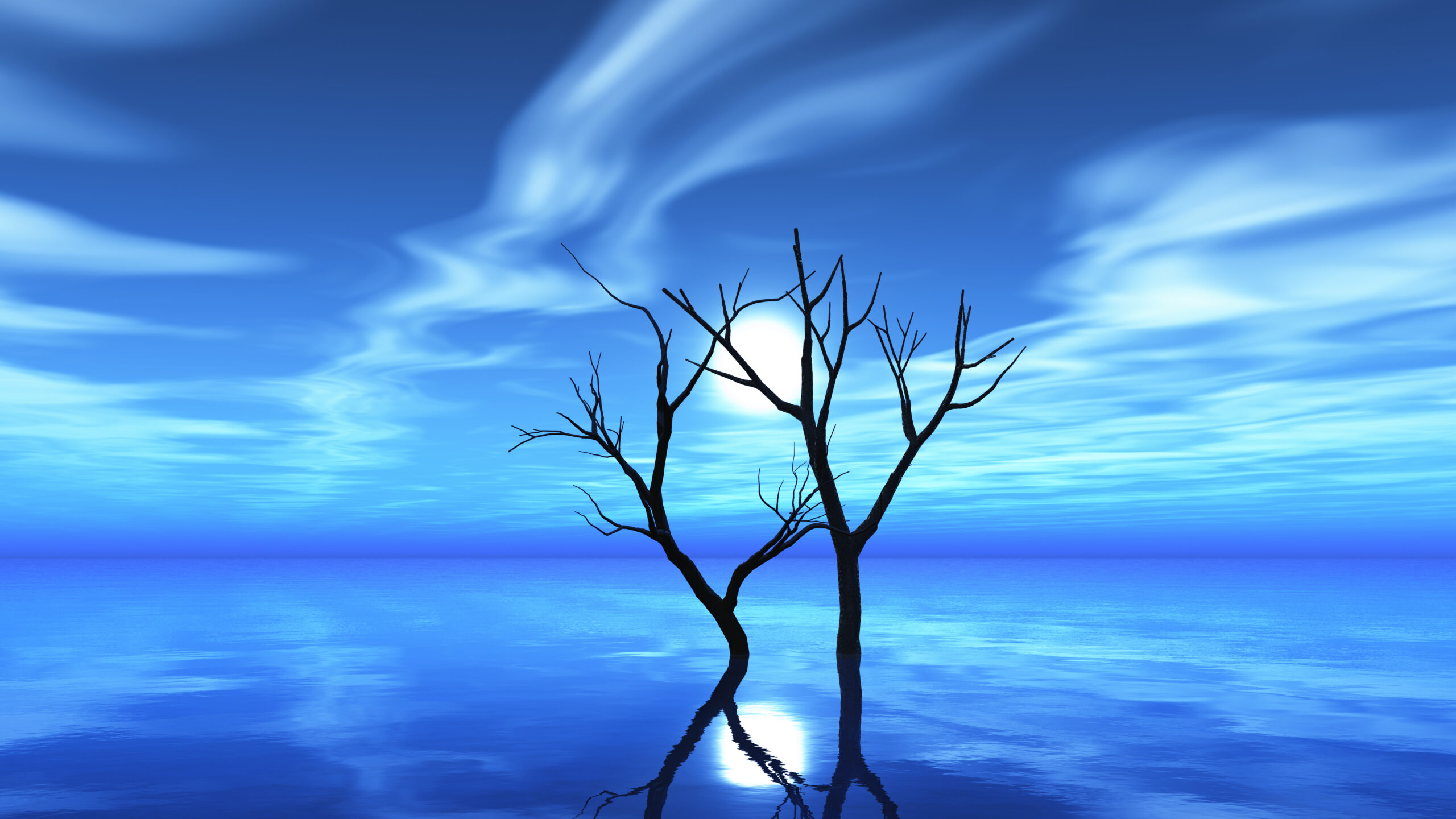
For our ancient ancestors, the presence of certain blues meant safety and sustenance. A clear blue sky signaled fair weather, safe travel, and good visibility. Bodies of water—rivers, lakes, the sea—were sources of life, pathways, and places to gather. Over millennia, our brains developed a positive, calming association with these blue vistas. They signaled a break from the immediate, ground-level dangers of predators or conflict, offering a moment of expansive, horizon-focused peace. This isn’t just poetic thinking; evolutionary psychologists suggest this deep-seated link is why blue consistently ranks as the world’s favorite color across cultures. It’s a color of promise and respite.
The Physiology of Cool: A Literal Temperature Drop?
Here’s where it gets fascinating. While color temperature (warm reds vs. cool blues) is a design principle, some studies suggest our bodies might react to it in subtle, physical ways. Warm colors (reds, oranges) are associated with fire, blood, and sun. They can stimulate the autonomic nervous system, slightly increasing heart rate, blood pressure, and arousal. Cool colors, especially blues and greens, do the opposite. They can promote a relaxation response.
I remember painting my home office a deep, stormy blue-grey a few years ago. Before, it was a stark white, which felt clean but also sterile and glaring under artificial light. After the blue went up, the first thing I noticed wasn’t visual—it was a feeling. The room just felt quieter, even before I’d moved any furniture back in. It felt like the walls had taken a step back. Friends who visited would often comment, “It’s so calm in here.” I don’t have scientific instruments to prove my blood pressure dropped, but subjectively, the space became a sanctuary for focus rather than a box for stress.
The Wavelength of Rest: Blue Light (The Other Kind)
Now, we must address the elephant in the room: blue light from screens. It’s crucial to distinguish between cooling blue light (the visual color) and high-energy visible (HEV) blue light (the specific 400-490 nm wavelengths emitted by LEDs and screens).
-
Cooling Blue (Visual): The color we perceive. Long, calming wavelengths that dominate in natural settings like the sky.
-
HEV Blue Light (Digital): Short, high-energy wavelengths that boost attention, reaction times, and mood during the day but are disruptive at night because they suppress melatonin, the sleep hormone.
This is the paradox of blue in the modern age. We are drawn to its calming essence, yet our primary daily interaction with a form of blue is through a device that can hijack our circadian rhythms. The key is intentionality. Seeking out natural, ambient cooling blue is a balm. Staring into the synthetic blue of a screen before bed is the opposite. It’s like the difference between drinking pure, cool water from a spring and drinking a highly caffeinated, blue-tinged energy drink. Both are blue-influenced, but their effects on your system are worlds apart.
A Palette of Peace: The Many Shades of Cooling Blue
Cooling blue isn’t a monolith. Its emotional impact shifts wonderfully with its shade, saturation, and context. Think of it as a family, each member with a slightly different personality.
-
Pale, Powder, and Sky Blues: These are the airy, weightless blues. They are the epitome of openness and freshness. A powder blue bedroom feels light, clean, and optimistic. It’s a breath of fresh air in color form. These shades are fantastic for small spaces, as they recede visually, making walls seem to float away.
-
True Cerulean and Azure: These are the confident, joyful blues of a midday Mediterranean sky. They are vibrant and clear, promoting mental clarity and focus without aggression. I find a cerulean blue notebook or a vase of this color on a desk sparks a certain creative alertness—it’s blue with a hint of energetic life.
-
Teal, Turquoise, and Aqua: Here, blue merges with green, invoking the cool clarity of tropical lagoons and polished sea glass. This is a profoundly balancing hue. The green brings a touch of organic, grounded life, while the blue maintains the cool serenity. It’s a fantastic color for spaces dedicated to wellness and self-care, like bathrooms or yoga studios. It feels both refreshing and nurturing.
-
Deep Navy, Indigo, and Twilight Blues: These are the contemplative, protective blues. They don’t shout; they whisper with depth and sophistication. A navy blue accent wall doesn’t feel cold; it feels enveloping and secure, like the night sky wrapping around you. It’s a color of quiet intellect and introspective calm.
-
Greyed-Out Blues (Blue-Greys): Think of the color of distant mountains, smooth river stones, or a misty morning. These are the most muted, sophisticated, and inherently peaceful of the cooling blues. By neutralizing the blue with grey, you strip away any potential for vibrancy, leaving pure, serene stillness. This is my personal favorite category for living spaces. It provides a flawless, calming backdrop that makes wood tones pop, metals shine, and indoor plants look exceptionally lush.
Cooling Blue in Action: Transforming Spaces and Minds
Knowing the theory is one thing. Seeing—and feeling—it in practice is another. Let’s look at how cooling blue is masterfully used in different fields to shape our experience.
The Sanctuary of Home: Interior Design
In interior design, cooling blue is a powerful tool to craft atmosphere.
-
Bedrooms: The undisputed champion for sleep spaces. Soft blues like pale aqua or misty blue-grey lower the energy of a room, priming the mind and body for rest. It’s a visual lullaby.
-
Bathrooms: Transforming a utilitarian space into a spa-like retreat is easy with cooling blue. Teal tiles, navy cabinetry, or pale blue walls evoke clean water and pristine freshness, turning a daily routine into a moment of renewal.
-
Home Offices and Study Nooks: As I discovered, blue can be a fantastic ally for concentration. It’s stimulating enough to keep you alert (unlike some overly relaxing colors) but devoid of the aggressive urgency of red or yellow. A deep blue-grey or an accent wall in a rich teal can help create a bounded, focused zone for work.
-
Hot Climates: In regions where the sun is relentless, historically, cooling blues (and whites) were used extensively on exteriors and interiors. From the whitewashed homes with blue shutters in the Greek Isles to the vibrant blue hues of Jodhpur, India, these colors psychologically (and some argue, even slightly physically) counter the heat, making living spaces feel cooler and more refreshing.
Branding with Trust: Corporate and Product Design
Look at the logos of Facebook, Samsung, PayPal, Intel, and LinkedIn. What’s a common thread? Blue. In branding, blue is the color of trust, reliability, security, and logic. A tech company or a bank uses blue to communicate stability and competence. A social media platform uses it to foster a sense of community and connection. When you see that cooling blue on an app icon or a website, it’s not trying to excite you; it’s trying to assure you. It says, “We are dependable. You are safe here.” It’s a non-verbal handshake.
Digital Spaces: UI/UX Design
This extends directly into the apps and websites we use daily. User Interface (UI) designers often employ shades of blue for key interactive elements, but carefully. A bright, saturated blue might be used for a primary “Submit” button—it’s clear and trustworthy. But for backgrounds, menus, and areas where the user needs to read or process information for long periods, softer, greyish blues are preferred. They reduce eye strain from contrast and create a calm digital canvas, preventing the user from feeling visually assaulted. That gentle blue-grey theme in your note-taking app? It’s deliberately cooling blue, designed to help your thoughts flow without distraction.
Beyond the Visual: Cooling Blue as a Lifestyle Concept
The power of cooling blue isn’t confined to what we paint on our walls or see on a screen. It’s a metaphor and a tool for holistic well-being.
The Mental “Cool Blue” Moment
This is a practice I’ve personally cultivated. When I feel anxiety bubbling up or frustration beginning to boil over, I use a “cooling blue” visualization. I close my eyes and imagine, with as much detail as possible, a specific blue scene. For me, it’s the view from a rocky coastline in Maine, looking out at the endless, dark blue Atlantic under a pale sky. I focus on the color of the water, the sound of the waves (a blue sound, if you will), and the feeling of the cool, salty air. I mentally “step into” that blue space for just 60 seconds. It’s a hard reset for the emotional thermostat. It’s not about avoiding problems, but about lowering the internal heat so I can address them from a place of calm, not chaos.
Seeking Natural Blue in Nature
Make it a point to seek out blue in the natural world. This is active cooling blue therapy. Go for a walk and consciously look up at the sky. Spend time by a body of water—a lake, river, or the sea. Watch the shifting blues from dawn to dusk. Gardening with blue flowers (delphiniums, hydrangeas, forget-me-nots) is another way to bring this calming hue into your daily vista. The act of seeking blue connects you to that ancient, hardwired sense of peace and expanse.
The Cool-Down Ritual: From Hot to Calm
Incorporate cooling blue into your transition rituals. After a stressful, “hot” day—full of deadlines and pressure—create a routine that signals a shift to “cool.” This could be changing into soft, blue loungewear. Lighting a candle with a fresh, aquatic scent (think sea salt, rain, or linen). Drinking a cool glass of water from a blue glass. Putting on a piece of ambient, atmospheric music that sounds blue. These sensory cues tell your nervous system that the heat of the day is over, and it’s time to restore and cool down.
A Personal Conclusion: My Journey with Blue
I wasn’t always a “blue” person. In my younger years, I was drawn to the warmth and energy of reds and oranges. They felt passionate and alive. But as life’s pace intensified, as the noise of the world grew louder, my preferences quietly shifted.
In a world that often feels like it’s burning with urgency, cultivating your own connection to cooling blue—whether through a paint can, a mindful moment, or a walk by the water—isn’t just decorative. It’s an act of quiet resistance, a way to build an interior sanctuary that no external chaos can overheat. So, I invite you to look for your blue. Find the shade that speaks to your need for peace, and let it in.
Frequently Asked Questions (FAQ)
Q1: Isn’t blue a cold and depressing color?
It can be, if used incorrectly or in the wrong context. A stark, electric blue in a poorly lit room can feel clinical. The key is in the shade and application. Choosing blues with warmth (hints of grey, green, or even a touch of violet), ensuring good lighting (preferably warm-toned lights to balance it), and pairing it with natural textures (wood, linen, wool) and warm metallics (brass, gold) completely transforms it from cold to cocooning. Think “cozy cabin by a winter lake” rather than “sterile hospital room.”
Q2: What are the best colors to pair with cooling blue?
Cooling blue is incredibly versatile.
-
With Whites & Greys: For a crisp, clean, and airy feel (think coastal style).
-
With Warm Woods & Neutrals: This is a perfect balance. The warmth of oak, rattan, or caramel leather tones down any potential chill in the blue, creating a rich, inviting, and sophisticated space.
-
As an Accent with Warm Colors: Small doses of coral, mustard yellow, or terracotta against a blue backdrop are stunning. The blue makes the warm colors pop, while the warm accents prevent the blue from feeling too distant.
-
With Other Cool Colors: Monochromatic schemes using different shades of blue, or pairing with soft greens (like sage), create a harmonious, peaceful, and naturally cohesive environment.
Q3: I want to use cooling blue in a room with no natural light. Is that a mistake?
Not at all, but you need to be strategic. In a north-facing room or one with little light, avoid dark, saturated navies, which can feel cave-like. Opt for the lightest, brightest members of the cooling blue family: pale sky blues, soft blue-greys, or whisper-soft aquas. Then, be very intentional with your artificial lighting. Use multiple layers of warm-white light (lamps, sconces) to bathe the blue walls in a gentle glow, countering any flatness and bringing the color to life.
Q4: How is “cooling blue” different from just “blue”?
“Cooling blue” emphasizes the effect and sensation of the color, not just its hue. It refers specifically to those blues that actively evoke feelings of calm, coolness, and tranquility. A neon blue or a highly saturated royal blue might be technically “blue,” but they are energizing and bold, not “cooling.” Cooling blue lives on the softer, muted, or deeper, more contemplative end of the blue spectrum. It’s about psychological temperature.
Q5: Can wearing cooling blue clothing affect my mood?
Absolutely! The concept of “enclothed cognition” suggests that the clothes we wear can influence our psychological processes. Wearing a soft blue scarf, a denim jacket, or a teal sweater can have a subtle calming effect on you. Moreover, color psychology suggests people may perceive you as more trustworthy, calm, and dependable when you wear blue—a bonus for important meetings or social situations where you want to project serene confidence.